Case study · Brand identity · Arabic and English · 2025
An IT brand built onthe idea of finding the way.
A visual identity for Massarat Al-Mustakshef, a Saudi IT company: a mark, colours, type and the brand in use.
- ClientMassarat Al-Mustakshef (MMIT), IT services
- WhereSaudi Arabia
- LanguagesArabic and English
- We madeLogo, colours, type, brand in use
The brief
What they
needed.
Massarat Al-Mustakshef builds secure IT for Saudi businesses: infrastructure, networks, cybersecurity and apps. The name means "the explorer's paths". They needed an identity that feels steady enough for IT and bold enough for Vision 2030.
What we made · Arabic and English
3 parts,
one brand.
-
01 / 03
The mark
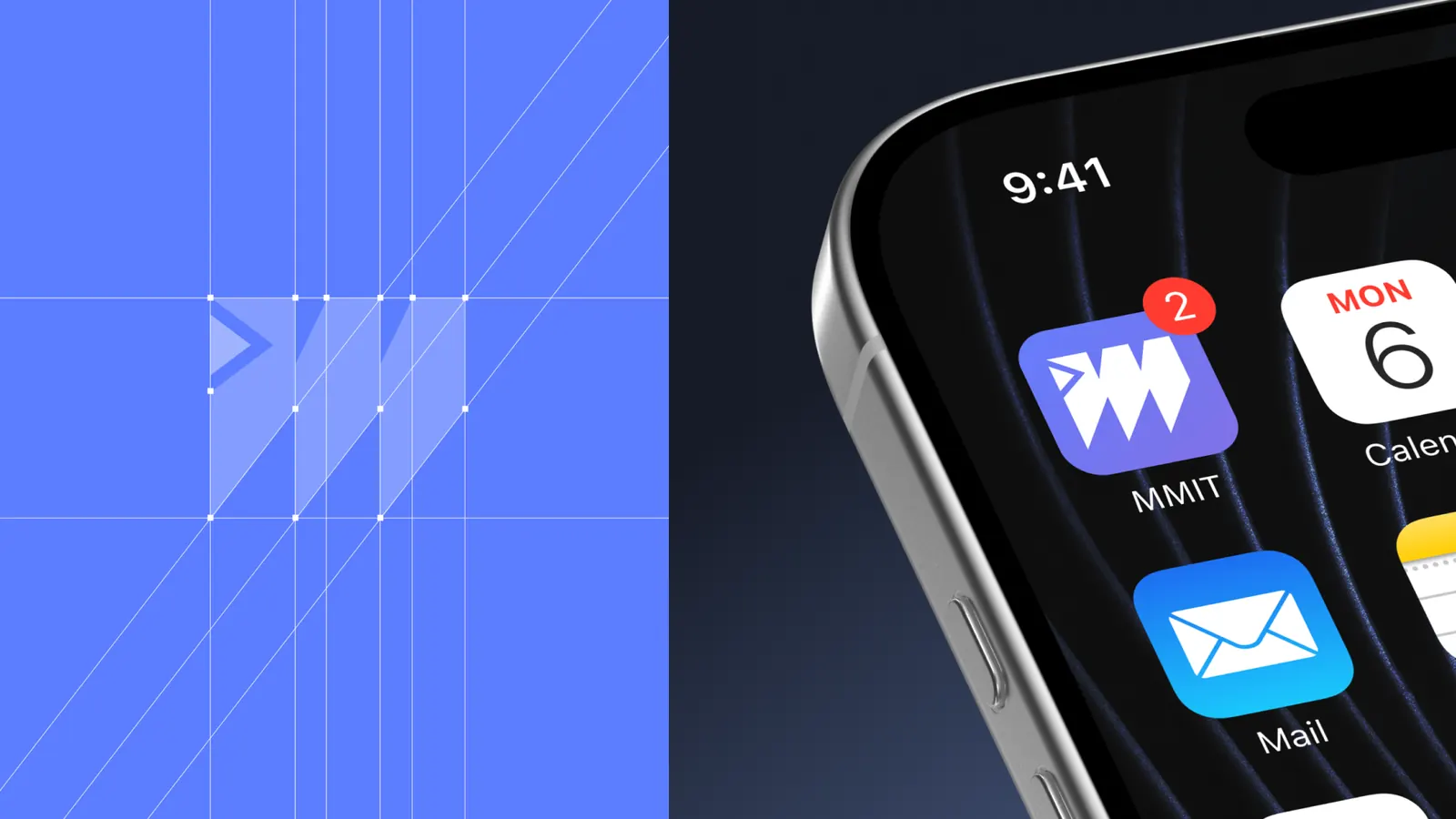
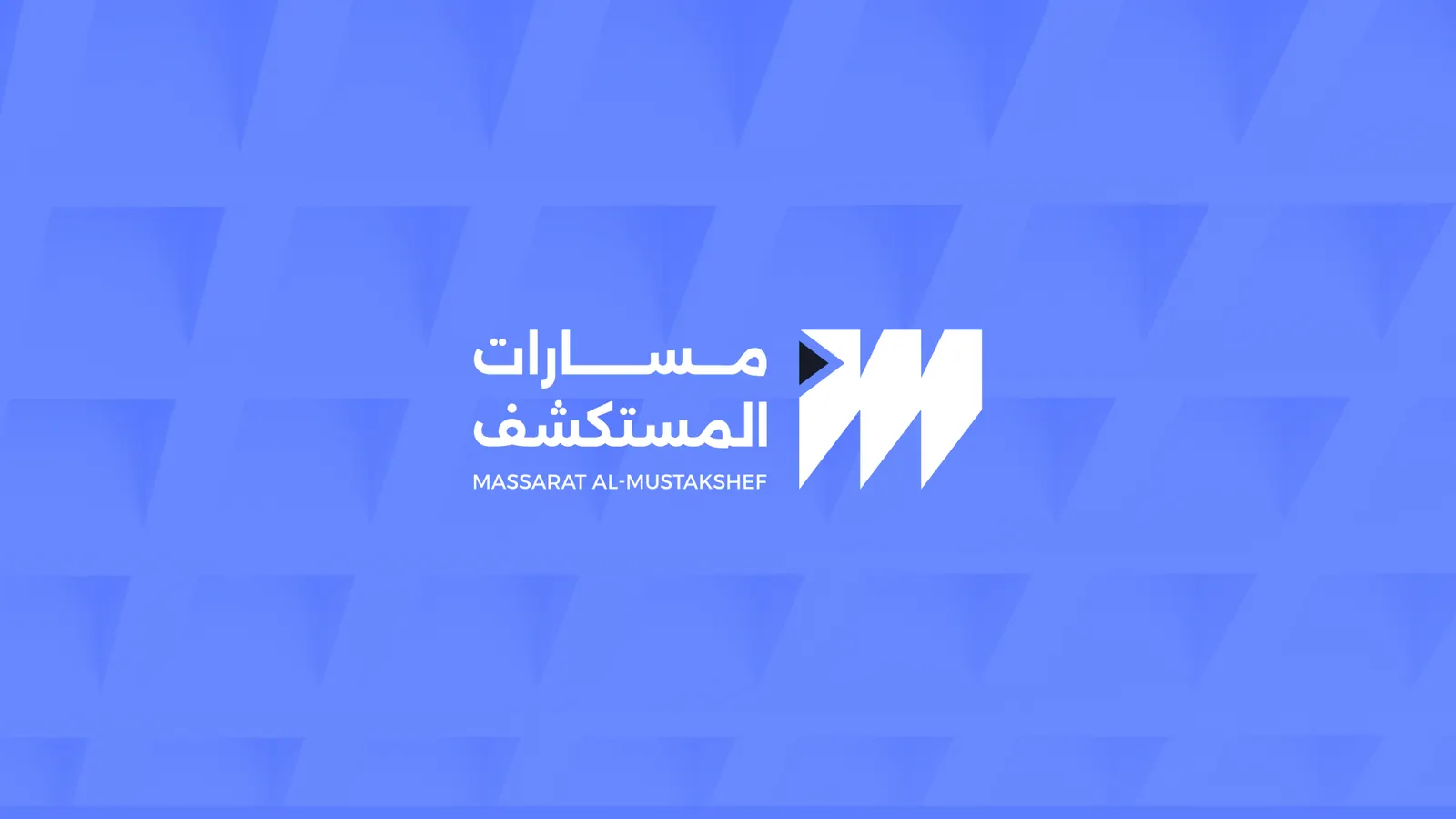
An M drawn as paths that move forward, set on a strict grid. It works as an app icon and in one colour.
-
02 / 03
Colour and type
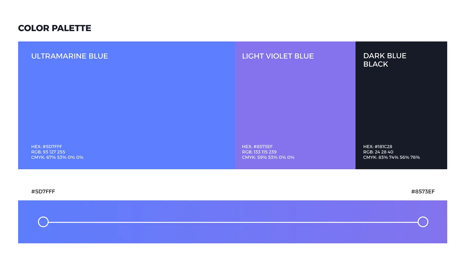
Ultramarine blue, a light violet and a near-black blue. Alexandria carries Arabic and English with the same voice.
-
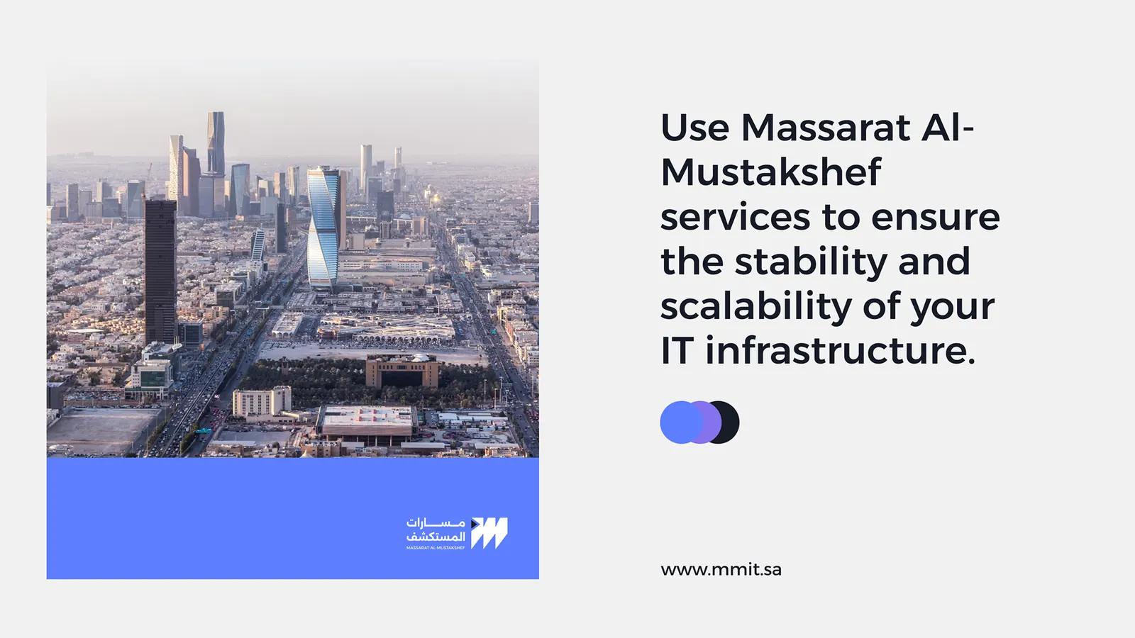
03 / 03
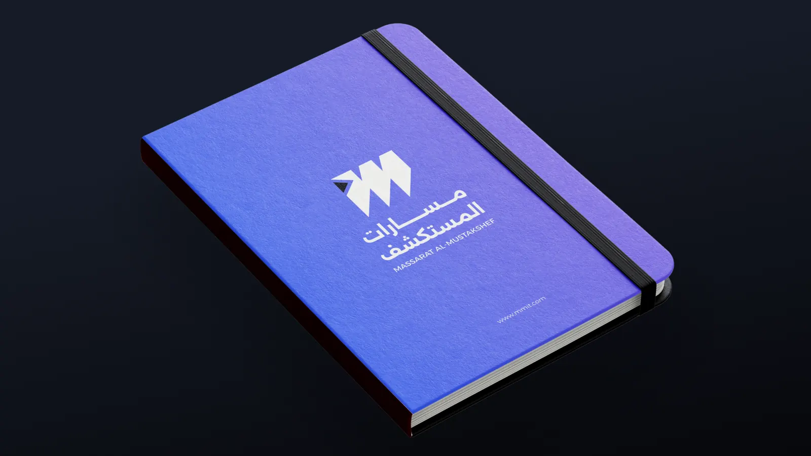
The brand in use
Stationery, social posts and outdoor, so the team can use the brand on day one.
The slides · 10
Every slide,
as delivered.
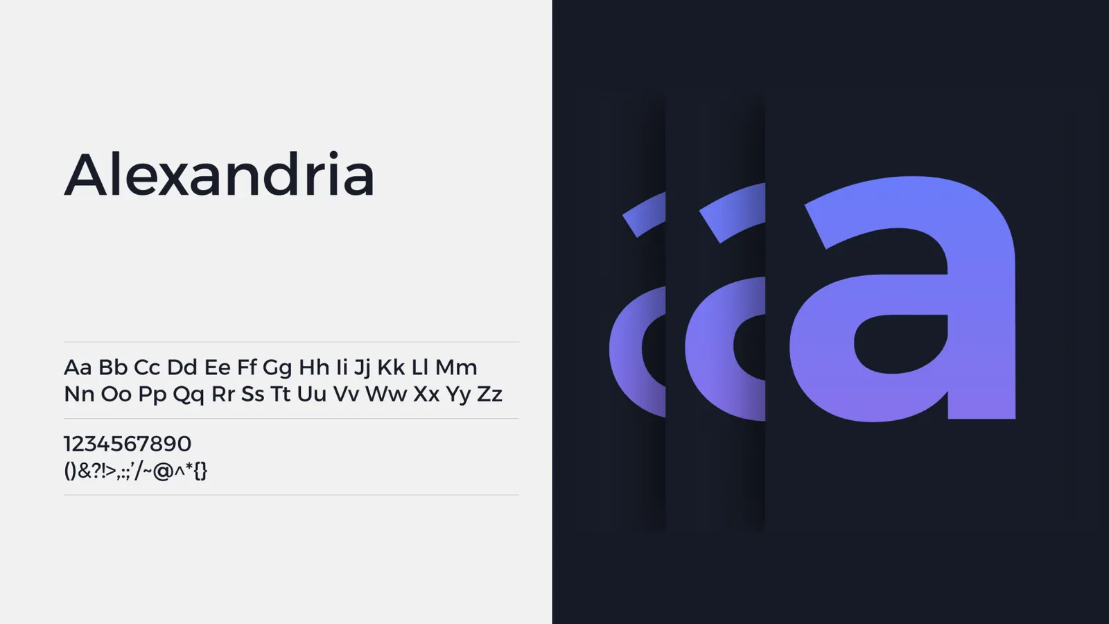
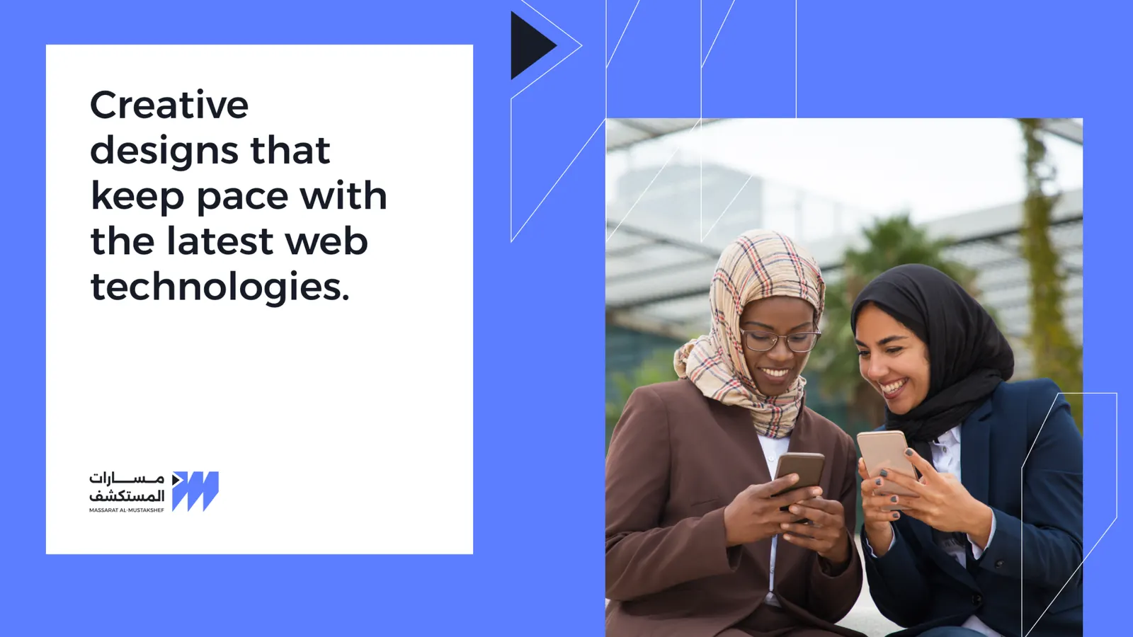
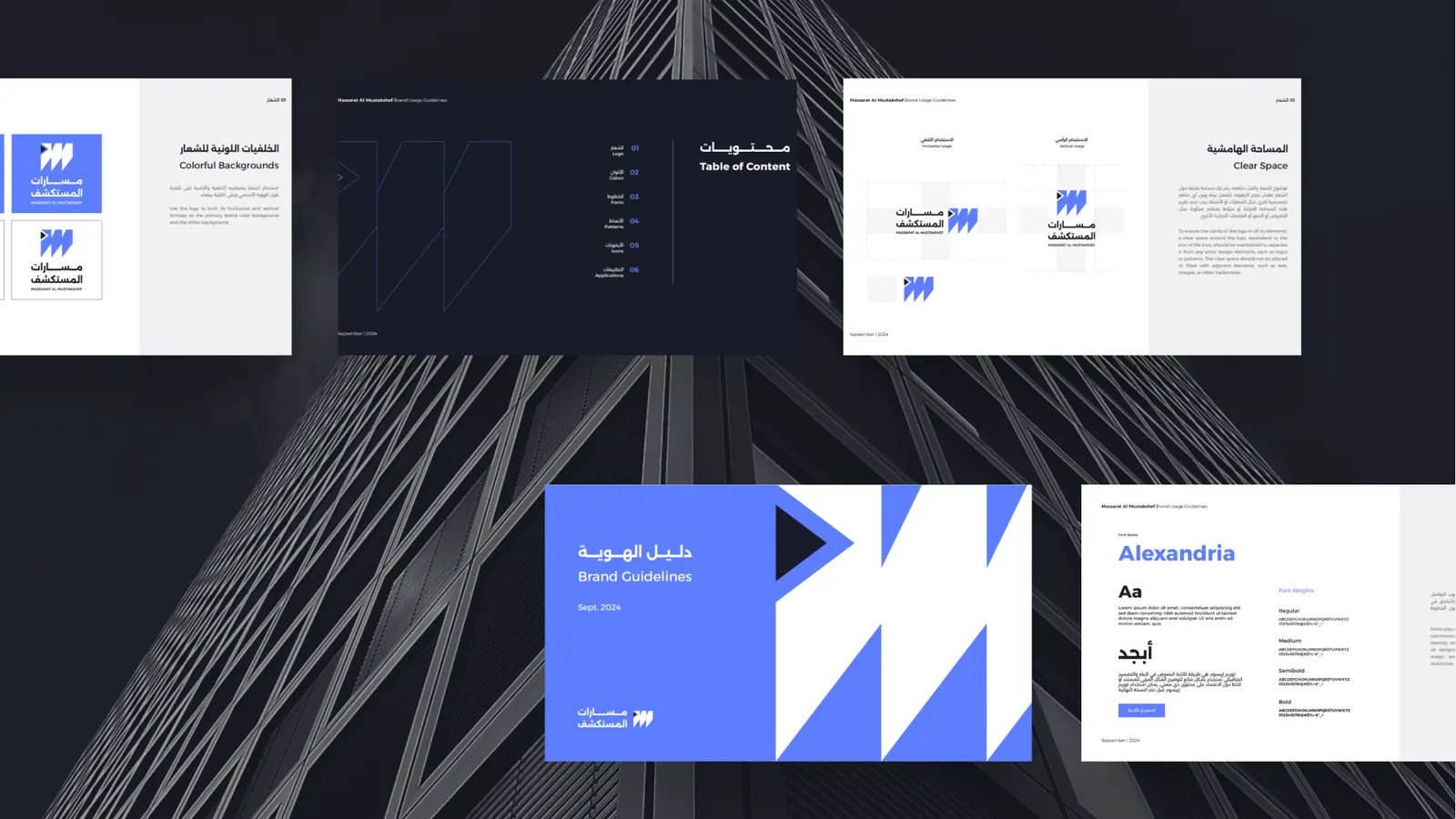
Drag, scroll or use the arrows.
The result
What
changed.
A brand Massarat uses across its documents, screens and campaigns, in Arabic and English.
A number and a few words from Massarat come next, once they say yes.
Start here
Tell the lab
where you are.
An idea, a launch, search or AI: one call tells you the next step.
We reply within one working day.